vue.js
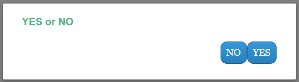
這個情況是使用者request 另一台server 所得到的值後想以不定的選項來決定要走向哪個頁面, 因此我決定用modal , 在modal 做兩個yes or no的按鈕, 並把值以GET的方式帶到hello頁面中做處理, 其它的值是放在後端以session帶著 只是在前面要讓使用者決定怎麼走
window.location.href = 'hello?option=' + msg;
如圖
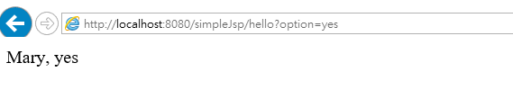
Mary 是session帶過來的值, 屬於在後面傳送, yes則是讓使用者在前端傳過來的值
關鍵在此
<button class="modal-default-button" @click="$emit('close','yes')">
<html>

<head>
    <meta http-equiv="Content-Type" content="text/html; charset=UTF-8">
    <script src="https://unpkg.com/vue"></script>
    <title>JSP Page</title>
</head>

<body>
    <header>
        <style type="text/css">
        .modal-mask {
            position: fixed;
            z-index: 9998;
            top: 0;
            left: 0;
            width: 100%;
            height: 100%;
            background-color: rgba(0, 0, 0, .5);
            display: table;
            transition: opacity .3s ease;
        }

        .modal-wrapper {
            display: table-cell;
            vertical-align: middle;
        }

        .modal-container {
            width: 400px;
            height: 80px;
            margin: 0px auto;
            padding: 20px 30px;
            background-color: #fff;
            border-radius: 2px;
            box-shadow: 0 2px 8px rgba(0, 0, 0, .33);
            transition: all .3s ease;
            font-family: Helvetica, Arial, sans-serif;
        }

        .modal-header h4 {
            margin-top: 0;
            color: #42b983;
        }

        .modal-body {
            margin: 20px 0;
        }
        /*http://www.bestcssbuttongenerator.com/*/

        .modal-default-button {
            float: right;
            background: #3498db;
            background-image: -webkit-linear-gradient(top, #3498db, #2980b9);
            background-image: -moz-linear-gradient(top, #3498db, #2980b9);
            background-image: -ms-linear-gradient(top, #3498db, #2980b9);
            background-image: -o-linear-gradient(top, #3498db, #2980b9);
            background-image: linear-gradient(to bottom, #3498db, #2980b9);
            -webkit-border-radius: 10;
            -moz-border-radius: 10;
            border-radius: 10px;
            font-family: Georgia;
            color: #ffffff;
            font-size: 15px;
            padding: 8px 9px 9px 8px;
            border: solid #1f628d 1px;
            text-decoration: none;
        }
        /*
                     * The following styles are auto-applied to elements with
                     * transition="modal" when their visibility is toggled
                     * by Vue.js.
                     *
                     * You can easily play with the modal transition by editing
                     * these styles.
                     */

        .modal-enter {
            opacity: 0;
        }

        .modal-leave-active {
            opacity: 0;
        }

        .modal-enter .modal-container,
        .modal-leave-active .modal-container {
            -webkit-transform: scale(1.1);
            transform: scale(1.1);
        }
        </style>
    </header>
    <!-- template for the modal component -->
    <script type="text/x-template" id="modal-template">
        <transition name="modal">
            <div class="modal-mask">
                <div class="modal-wrapper">
                    <div class="modal-container">
                        <div class="modal-header">
                            <slot name="header">
                            </slot>
                        </div>
                        <div class="modal-footer">
                            <slot name="footer">
                                <button class="modal-default-button" @click="$emit('close','yes')">
                                    YES
                                </button>
                                <button class="modal-default-button" @click="$emit('close','no')">
                                    NO
                                </button>
                            </slot>
                        </div>
                    </div>
                </div>
            </div>
        </transition>
    </script>
    <!-- app -->
    <div id="app">

        <!-- use the modal component, pass in the prop -->
        <modal v-if="showModal" @close="say">
            <!--
                  you can use custom content here to overwrite
                  default content
                -->
            <h4 slot="header">YES or NO</h4>
        </modal>
    </div>
    <script>
    // register modal component
    Vue.component('modal', {
        template: '#modal-template'

    })

    // start app
    new Vue({
        el: '#app',
        data: {
            showModal: true
        },
        methods: {
            say: function(msg) {
                console.log(msg);
                this.showModal = false;
                window.location.href = 'hello?option=' + msg;
            }
        }
    })
    </script>
</body>

</html>