css 中最常用的特性(property)之一就是 background ,這個有什麼好難的?事實上 background 到了css3後增加了不少特性,這些特性真的有很多細節,我整理此篇。
background 是一個很特別的特性,因為他有很多種的寫法,例如:
background: red; /* 紅色背景 */
background: url(/path/to/your/pic.jpg); /*使用圖片當背景 */
background: -moz-linear-gradient(top, rgba(47,158,226,1) 0%, rgba(221,241,255,0.48) 56%, rgba(221,241,255,0.07) 100%); /* FF3.6+ 產生漸層背景 */
一、基本寫法
1. 單色背景
簡單的寫法,可以使用色名、色票或顏色函式[1]。
background: red; /* 紅色背景 */
background: #FF0000; /* 紅色背景 */
background: rgb(255,0,0); /* 紅色背景 */
background: rgba(255,0,0,1); /* 紅色背景 */
background: hsl(0,100%,100%); /* 紅色背景 */
background: hsla(0,100%,100%,1); /* 紅色背景 */
以上的background 可改用 background-color 指定:
background-color: #14A080; /* 青色背景 */
2. 用圖片當背景
使用圖片當背景必須用到 url 這個函數,請注意圖檔路徑不要使用引號,無論是單或雙引號
background: url(/path/to/your/pic.jpg); /* 使用絕對位址,這指到網站的根目錄 */
background: url(path/to/your/pic.jpg); /* 使用相對位址,圖檔要放在css檔所在的相對位置 */
background: url(http://example.com/path/to/your/pic.jpg); /* 使用網址url */
3. 圖片加上顏色背景
同時設定圖片和顏色當背景會怎樣?顯示顏色還是圖片?
當有圖片時,會顯示圖片,當沒有圖片時,顯示背景色。(X) 錯誤觀念
圖片和背景色會同時顯示,圖片一定在前,背景色在後,圖片找不到會顯示背景色。(X) 錯誤觀念
圖片和背景色會同時顯示,由css的順序決定圖片或背景色誰在前誰在後。(O)
此例圖片在前,背景色在後。如果圖片是有透明度的png,會同時顯示顏色和圖片,以前這樣子可以做出多重背景效果。
#example1 {
background: yellow;
background-image:url(http://www.google.com/intl/en_com/images/srpr/logo3w.png);
}
此例圖片在後,背景色在前。黃色會完全擋住圖片,這樣的寫法圖片就沒意義存在,所以沒人這樣寫。
#example2 {
background-image:url(http://www.google.com/intl/en_com/images/srpr/logo3w.png);
background: yellow;
}
4. 速記寫法(shorthand)
background有很多分屬性:
.header {
background-color: #fff;
background-image: url(image.gif);
background-repeat: no-repeat;
background-position: top left;;
}
可以寫成速記方式,用一長串來表式,但是得照順序寫,有時漏一兩項還是能正確的顯示,只是我沒測過是不是每個瀏覽器都能正常:
background: #fff url(image.gif) no-repeat top left;
}
範例:
background: #000 url(image.gif); top left / 50% 20% no-repeat border-box content-box;
5. 拆開來的寫法
background: #000 url(image.gif); top left / 50% 20% no-repeat border-box content-box;
上例拆開來的寫法:
background-color: #000;
background-image: url(image.gif);
background-position: top left;
background-size: 50% 20%;
background-repeat: no-repeat;
background-origin: border-box;
background-clip: content-box;
二、CSS3新增背景特性
css3 有新增三個特性 background-clip、background-origin、background-size,也擴充原本的background和background-image:
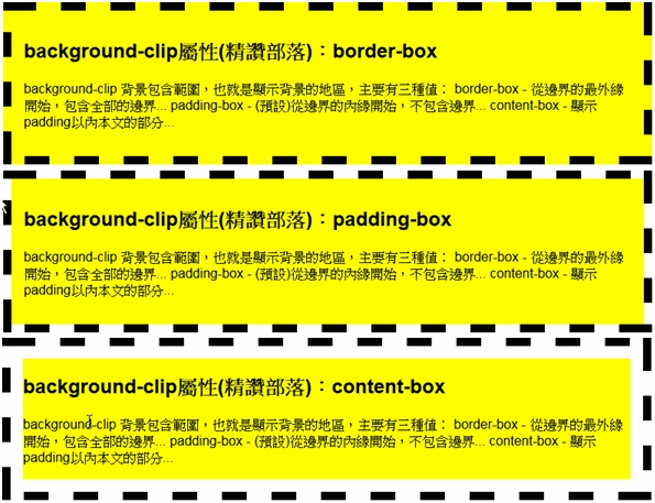
1. background-clip 背景包含範圍
就是顯示背景的地區,主要有三種值:
- border-box - 從邊界的最外緣開始,包含全部的邊界,當不是實心的邊界時,這個值才會有效果。
- padding-box - (預設)從邊界的內緣開始,不包含邊界,如果是實心的邊界時,這個值效果和border-box相同。
- content-box - 顯示padding以內本文的部分,不包括padding的空白。
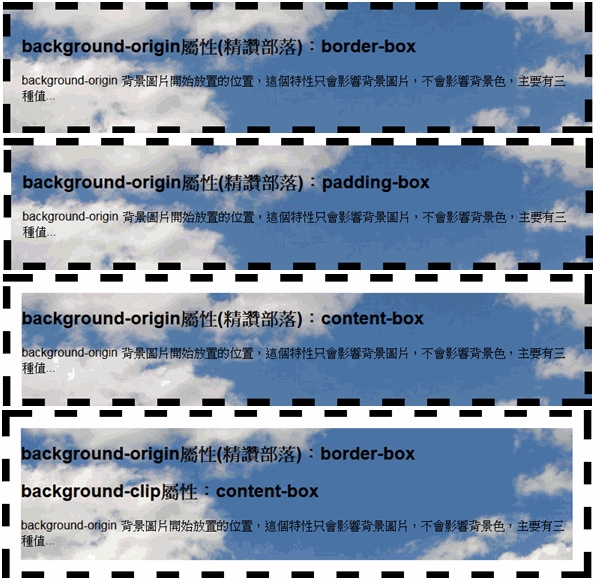
2. background-origin 背景圖片開始放置的位置
這個特性只會影響背景圖片,不會影響背景色,主要有三種值:
- border-box - 從邊界的最外緣開始放置圖片。
- padding-box - (預設)從邊界的內緣開始放置圖片,請注意,當background-clip設定成border-box,但是圖片也要設成border-box,否則左側和上側的框會出現空白。
- content-box - 從padding以內本文的部分開始顯示背景圖片。
重點提示:
- 這個特性要和background-clip配合使用,否則結果可能會超出你的預期。
- 這個特性只影響背景圖片,不影響背景色。
- background-clip是背景顯示範圍、background-origin是背景圖左上角的位置、
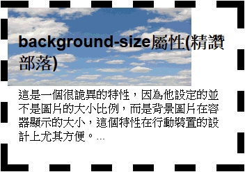
3. background-size 改變背景圖片顯示的範圍大小
以前背景圖大小不對時得先用繪圖軟體修改成當大小再上傳,但現在不必了。
這是一個很詭異的特性,因為他設定的並不是圖片的大小比例,而是背景圖片在容器顯示的大小,這個特性在行動裝置的設計上尤其方便。
background-size:50%; /*容器中只顯示50%的背景*/
background-size:50% auto; /* 有時同上 */
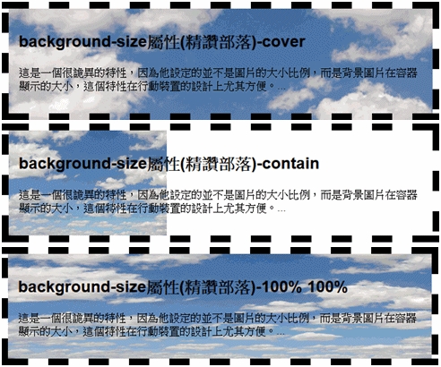
background-size:80% 50%; /*寬顯示80%,高顯示50%,如下圖例,為了符合要求,原背景圖都變形 */
background-size:500px 200px; /* 容器中寬顯示500px,高顯示200px的背景*/
background-size:auto; /* 等比例縮放的概念,有點類似 contain。如果背景圖夠大,就原圖大小呈現(部分呈現) */
background-size:cover; /*等比例縮放背景後容器全部都能顯示背景,不會讓圖片變形,所以有些部分會顯示不到,很方便,這和 100% 100%是不同的觀念,100%會縮放變形 */
background-size:contain; /* 等比例縮放背景,但為了顯示全部背景圖片,所以只會縮放到一邊最大後停止,這會讓一部分沒有背景 */
參考資料
[1] http://www.w3schools.com/cssref/css_colors_legal.asp
[2] W3C css syntax
原文 2015-08-09 02:44:15