CSS中如果想要用直列的文字,只要把文字選擇直式顯示即可,這時可使用 writing-mode屬性。
這個屬性預設是水平顯示,也就是
writing-mode: horizontal-tb;
可以使用由右到左和由左到右的垂直顯示方式
writing-mode: vertical-rl;
writing-mode: vertical-lr;
來看看範例
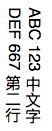
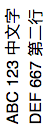
由右至左垂直文字
HTML
<div>ABC 123 中文字<br/>DEF 667 第二行</div>
CSS
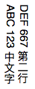
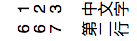
由左至右垂直文字
HTML
<div>ABC 123 中文字<br/>DEF 667 第二行</div>
CSS
上面的設定中,英文的方向都是由右到左,如果想要讓他轉個180度,突然想到原本CSS有個由右至左有CSS,不知管不管用:
上面這個只對水平顯示有用,對垂直的是完全沒作用。
所以如果要讓文字轉180度,就得使用 text-orientation 這個屬性質,他有幾個參數可以設定[1]:
text-orientation: mixed; 預設值,就是上面看到的那樣
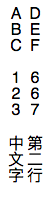
text-orientation: upright;
text-orientation: sideways-right;
text-orientation: sideways;
text-orientation: use-glyph-orientation;
text-orientation: inherit;
text-orientation: initial;
text-orientation: unset;
CSS
text-orientation: upright;
CSS
text-orientation: sideways-right;
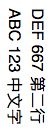
原本轉不過去的中文字也橫轉
CSS
text-orientation: sideways;
sideways 和 sideways-right 看不出差異,這兩個是相同的。
text-orientation: use-glyph-orientation; 這個是給svg圖型用的,搭配作廢的什麼svg屬性,有興趣的人再去研究
到目前為只,都沒有辦法把文字轉向逆時針90度方向,無論中文或英數,都只能垂直或是順轉90度。
要逆轉90度或更多,得使出殺手鐧了。
中文字逆轉90度
使用transform的rotate函數
text-orientation: sideways;
transform: rotate(-180deg);
text-orientation: upright;
transform: rotate(-90deg);
如果把upright的轉90度,就會變成這樣,字掉到畫面外,因為字的align是中央,旋轉後以中央為軸心
你得設定區塊的寬度讓他可以完全顯示,加上以下:
或是修改旋轉的軸心,這部分可以參考[3] +transform-origin(0,0)。這裡我沒有試,他的範例還做了一個時鐘,超酷的。
參考資料
[1] https://developer.mozilla.org/en-US/docs/Web/CSS/text-orientation
[2] 改变CSS世界纵横规则的writing-mode属性 https://www.zhangxinxu.com/wordpress/2016/04/css-writing-mode/
[3] CSS沒有極限 - CSS transform-origin https://wcc723.github.io/css/2013/10/10/css-transform-origin/